Quantcast
Channel: Sarina DuPont, Product Manager RAD Studio
Viewing all 132 articles
Browse latest View live

Using existing ClientDataSet data in FDMemTable

$
0
0

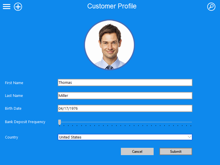
For today’s #DelphiWeek post, I thought I would highlight how you can use existing ClientDataSet (.cds) data in FDMemTable. With this approach, you can also save existing .cds data as JSON, for example. In this tutorial, I am going to create a new application, but you could also use this approach with an existing application.

  1. Create a new Multi-Device Application (FireMonkey) or VCL Forms Application
  2. Place a TClientDataSet onto your form
  3. Place a TFDMemTable onto your form
  4. Right-click on the TClientDataSet component, and select ‘Load from MyBase table…’LoadMybase
  5. Browse to your data. In this example, I am using the country.cds file located in C:\Users\Public\Documents\Embarcadero\Studio\15.0\Samples\Data 
  6. Right-click on FDMemTable and select ‘Assign DataSet’. Select ClientDataSet1 and click OK.AssignDataSet
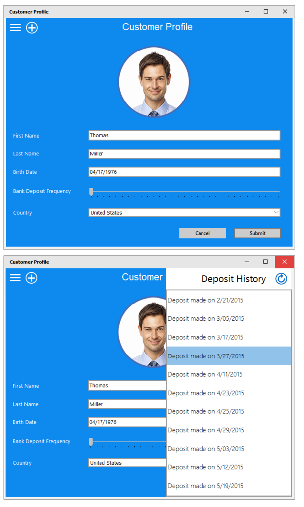
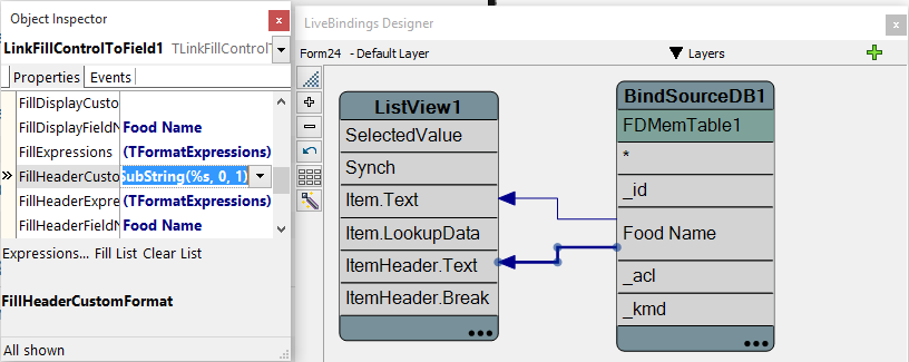
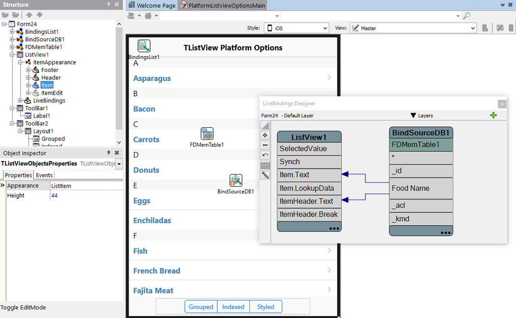
  7. Next, bind the data to a UI control, such as TGrid using the LiveBindings Designer. This step is optional.
    LBDesigner2
  8. Select ‘Save to File’ on FDMemTable. 
    SaveToFile
  9. You can save the data as an XML file, Binary file or JSON file. In this case, I saved it as a JSON file. 
    SaveAsDialog
  10. Now you can use this data and load it directly to an FDMemTable component without                         assigning it to a TClientDataSet component.

             LoadFromFile

JsonFile

Here is a small section of the .JSON data file:

{"FDBS":{"Version":14,"Manager":{"UpdatesRegistry":true,"TableList":[{"class":"Table","Name":"FDMemTable1","SourceName":"Table","TabID":0,"EnforceConstraints":false,"MinimumCapacity":50,"CheckNotNull":false,"CheckReadOnly":false,"ColumnList":[{"class":"Column","Name":"Name","SourceName":"Name","SourceID":1,"DataType":"AnsiString","Size":24,"Searchable":true,"AllowNull":true,"Unnamed":true,"Base":true,"OAllowNull":true,"OInUpdate":true,"OInWhere":true,"OriginColName":"Name","SourceSize":24},{"class":"Column","Name":"Capital","SourceName":"Capital","SourceID":2,"DataType":"AnsiString","Size":24,"Searchable":true,"AllowNull":true,"Unnamed":true,"Base":true,"OAllowNull":true,"OInUpdate":true,"OInWhere":true,"OriginColName":"Capital","SourceSize":24},{"class":"Column","Name":"Continent","SourceName":"Continent","SourceID":3,"DataType":"AnsiString","Size":24,"Searchable":true,"AllowNull":true,"Unnamed":true,"Base":true,"OAllowNull":true,"OInUpdate":true,"OInWhere":true,"OriginColName":"Continent","SourceSize":24},{"class":"Column","Name":"Area","SourceName":"Area","SourceID":4,"DataType":"Double","Searchable":true,"AllowNull":true,"Unnamed":true,"Base":true,"OAllowNull":true,"OInUpdate":true,"OInWhere":true,"OriginColName":"Area"},{"class":"Column","Name":"Population","SourceName":"Population","SourceID":5,"DataType":"Double","Searchable":true,"AllowNull":true,"Unnamed":true,"Base":true,"OAllowNull":true,"OInUpdate":true,"OInWhere":true,"OriginColName":"Population"}],"ConstraintList":[],"ViewList":[],"RowList":[{"RowID":0,"RowState":"Unchanged","Original":{"Name":"Argentina","Capital":"Buenos Aires","Continent":"South America","Area":2777815,"Population":32300003}},{"RowID":1,"RowState":"Unchanged","Original":{"Name":"Bolivia","Capital":"La Paz","Continent":"South America","Area":1098575,"Population":7300000}},{"RowID":2,"RowState":"Unchanged","Original":{"Name":"Brazil","Capital":"Brasilia","Continent":"South America","Area":8511196,"Population":150400000}},


VCL and FireMonkey Style Gallery

$
0
0

With C++Builder, Delphi and RAD Studio XE7, we make it easy to customize the look of your application. You can choose from the built-in bitmap based native styles or work with custom styles. We recently added a VCL Styles Gallery and a FireMonkey Styles Gallery to our website where you can see a great preview of all the bitmap based styles.

VCLStylesGallery 

FMXStylesGallery1

Special offers and bonuses with your purchase of RAD Studio XE7, Delphi XE7, or C++Builder XE7!


Working with StylesData in your FireUI applications

$
0
0

I have been getting some questions recently on how to identify and access style elements using StylesData. StylesData is defined by the style and different controls can have different elements.

To identify and access the style elements in code that you want to change programmatically, you first need to set the style properties for each item at design time. You can then view the structure for those style items defined in the style using the built-in Style Designer in the IDE. You can choose "Edit default style" to see objects in the Style Designer in the IDE.
Note: "Edit default style" is only available for Desktop views, but Desktop styles have the same structure as mobile styles.

In this example we are using a ListBox item, but the steps are similar for customizing the style of other controls.

Step 1: Add a ListBox to your form and right-click to add a ListBoxItem

Step 2: Set the style of your ListBoxItem element by setting the StyleLookUp property. In this case, we set it to listboxitemrightdetail

Step 3: Select ListBoxItem1’s ItemData property in the Object Inspector. Set an accessory, detail text, item text and a bitmap image

Step 4: Right-click on ListBoxItem1 on the form and select ‘Edit Default Style’

StylesData1 1

Step 5: Expand the layout1 item in the Structure view in the Style Designer. Here you see the style element name of the ItemData items that we set in Step 3. This gives you an indicator on how to call these in code in order to change them programmatically.

For example:  FMXObject := ListBoxItem1.FindStyleResource(’icon’);

StylesData2

In my demo, I am going to load a bitmap from resources and change the detail text color programmatically. To load an image from Resources, go to Project->Resources and Images and add your image.  image1

This sample code changes the listbox item image and detail text color at runtime when the ‘Change Style’ button is clicked.

procedure TForm1.ChangeStyleClick(Sender: TObject);
var
  FMXObject: TFMXObject;
  FImage: TImage;
  FDetailObject: TActiveStyleTextObject;
  FStream: TResourceStream;
begin
  FImage := nil;
  FMXObject := ListBoxItem1.FindStyleResource('icon');
  if (FMXObject <> nil) and (FMXObject is TImage) then
    FImage := TImage(FMXObject);
  FMXObject := ListBoxItem1.FindStyleResource('detail');
  if (FMXObject <> nil) and (FMXObject is TActiveStyleTextObject) then
  begin
    FDetailObject :=  TActiveStyleTextObject(FMXObject);
    FDetailObject.Color := TAlphaColorRec.Red;
  end;
  if (FImage <> nil) and (FImage.Visible) then
  begin
    // load image from resources (*.res file)
    FStream := TResourceStream.Create(HInstance, 'Image1', RT_RCDATA);
    try
      FImage.Bitmap.LoadFromStream(FStream);
    finally
      FStream.Free;
    end;
    // do something with the image
    FImage.WrapMode := TImageWrapMode.Stretch;
  end;
end;
end.

Here is an example of what this looks like at runtime:

colorchange

For additional information on StylesData, please see this docwiki article. 

See What’s New in RAD Studio XE8

$
0
0

I am really excited about today’s Delphi, C++Builder and RAD Studio XE8 release.

With RAD Studio XE8, now is the time to extend your VCL and FireMonkey Apps with Mobile, Cloud, Wearables and the Internet of Things! Have a look at our What’s New video to get a quick overview of the great new features included in this release.

SeeWhatsNewVideoImage

IDE Productivity

Register for the RAD Studio XE8 First Look Webinar this Thursday: http://forms.embarcadero.com/WindowsAndBeyond_AnnouncingRADStudio

Download a Free Trial today: http://www.embarcadero.com/downloads

Building Proximity Aware Application with RAD Studio XE8

$
0
0

RAD Studio XE8 provides you with the tools to rapidly design, build, and deploy connected apps that deliver innovative IoT solutions.

The new Beacon component makes it easy to add proximity awareness to your applications.

Beacons Proximity Stadium Large

Two beacon formats are available: iBeacon and AltBeacon.

  • iBeacon is a format defined by Apple. When working with iBeacons, select the Standard Mode available for the TBeacon component.
  • AltBeacon is an open format, known as Alternative beacon. The full specifications can be found on http://altbeacon.org. When working with AltBeacons, select the Alternative Mode for the TBeacon component.  

Bluetooth Low Energy devices in advertising mode send the Advertising Data repeatedly over radio in different AD type structures.

One of the AD types in the Advertising Data is the "Manufacturer Specific Data" which is utilized for beacons. The data included in the "Manufacturer Specific Data" is:

  • UUID: A unique identifier which identifies a group of beacons, for example, the beacons of a specific company.
  • MajorID, MinorID: Identifies regions inside a specific UUID. MajorID identifies a sub-region within a larger region defined by an UUID. The MinorID specifies further subdivision within a MajorID.
  • TxPower: The TxPower is the measured power from 1 meter of distance. With TxPower and the Received Signal Strength Indicator (RSSI), the approximate distance to a Beacon is calculated.

iBeacon requires both major and minor numbers to be defined.

Major numbers are designed to identify a group while minor numbers are designed to identify an individual beacon.

TBeacon has a property called MonitorizedRegions that lets you define the UUID, minor and major numbers for your beacons. Generally speaking, all your beacons should use the same UUID. You would then change the Major and Minor values based on your needs.

If you set the Major and Minor values to -1, it indicates that you want to track all beacons using that same UUID. You can then programmatically define the Major and Minor numbers and execute actions depending on which beacon was detected.

A good practice would be to store the beacon information in a database. Then, the client app running on the user’s smartphone or tablet can connect to the same database.

Upon detecting the beacon in your application, you will receive an event. In the event, you can read the major and minor values and then fire another action, such as displaying a location specific message as the user approaches a specific beacon.

Below is a sample use case showing how major and minor numbers for beacons can be used in a real world scenario to identify them.

Tradeshow Beacon Use Case:

- 4 exhibit halls, so major numbers of 1 – 4 are being used to identify the 4 exhibit halls

- Each exhibit has 20 booths, so each beacon is assigned a minor number of 1 to 20

-   This means that there are a total of 80 beacons used in this scenario

Beacons are supported on Android, iOS and OS X. Beacons are not supported on Windows since
the beacon advertising data is not accessible on Windows.
Detailed information on setting permissions to use beacons etc. can be found on our docwiki:

Here is a quick code example that finds nearby beacons:

unit BeaconForm;

interface

uses
  System.SysUtils, System.Types, System.UITypes, System.Classes, System.Variants,
  FMX.Types, FMX.Controls, FMX.Forms, FMX.Graphics, FMX.Dialogs, System.Beacon,
  System.Beacon.Components, FMX.StdCtrls, FMX.Controls.Presentation,
  FMX.ListBox, FMX.Layouts;

type
  TBeaconDiscoverForm = class(TForm)
    StartDiscoveryBtn: TButton;
    CancelDiscoveryBtn: TButton;
    Timer1: TTimer;
    Label1: TLabel;
    BeaconDistance: TLabel;
    ToolBar1: TToolBar;
    Label5: TLabel;
    BeaconDiscoveryList: TListBox;
    ListBoxGroupHeader1: TListBoxGroupHeader;
    ListBoxItem1: TListBoxItem;
    ListBoxItem2: TListBoxItem;
    ToolBar2: TToolBar;
    Beacon1: TBeacon;
    procedure StartDiscoveryBtnClick(Sender: TObject);
    procedure CancelDiscoveryBtnClick(Sender: TObject);
    procedure Beacon1BeaconProximity(const Sender: TObject;
      const ABeacon: IBeacon; Proximity: TBeaconProximity);
    procedure Timer1Timer(Sender: TObject);
    procedure Beacon1BeaconEnter(const Sender: TObject; const ABeacon: IBeacon;
      const CurrentBeaconList: TBeaconList);
  private
    { Private declarations }
    FBeacon : IBeacon;
  public
    { Public declarations }
  end;

var
  BeaconDiscoverForm: TBeaconDiscoverForm;

implementation

{$R *.fmx}
{$R *.LgXhdpiPh.fmx ANDROID}
{$R *.iPhone47in.fmx IOS}
{$R *.Macintosh.fmx MACOS}

procedure TBeaconDiscoverForm.Beacon1BeaconEnter(const Sender: TObject;
  const ABeacon: IBeacon; const CurrentBeaconList: TBeaconList);
begin
  if ABeacon <> nil then;

end;

procedure TBeaconDiscoverForm.Beacon1BeaconProximity(const Sender: TObject;
  const ABeacon: IBeacon; Proximity: TBeaconProximity);
begin
  if Proximity = TBeaconProximity.Near  then
  begin
    FBeacon := ABeacon;
    Label1.Text := 'Beacon: '+ FBeacon.GUID.ToString+'   Major:'+FBeacon.Major.ToString+' Minor:'+FBeacon.Minor.ToString;
  end;
end;

procedure TBeaconDiscoverForm.StartDiscoveryBtnClick(Sender: TObject);
begin
  Beacon1.StartScan;
  Timer1.Enabled := True;
end;

procedure TBeaconDiscoverForm.CancelDiscoveryBtnClick(Sender: TObject);
begin
  Beacon1.StopScan;
  Timer1.Enabled := False;
end;

procedure TBeaconDiscoverForm.Timer1Timer(Sender: TObject);
begin
    if FBeacon <> nil then
    BeaconDistance.Text := FBeacon.Distance.ToString + 'm';
end;

end.

You can download the demo here. This is the same demo that I showed during the XE8 launch webinar today. It has UUIDs predefined for the following manufacturers:

  • Estimote
  • Radius Networks
  • BLE Home
  • EM Microelectronic

If you are using beacons by a different manufacturer or are using custom UUIDs, you can add/edit them via the MonitorizedRegions property on TBeacon.

You can also watch the beacon proximity skill sprint here: https://www.youtube.com/watch?v=_VWFk3RTW8A

Several different beacon focused demo projects for Delphi and C++ are also installed with RAD Studio XE8. You can access them by going to:

C:\Users\Public\Documents\Embarcadero\Studio\16.0\Samples\Object Pascal\Mobile Samples\Device Sensors and Services\Bluetooth\Beacons

C:\Users\Public\Documents\Embarcadero\Studio\16.0\Samples\CPP\Mobile Samples\Device Sensors and Services\Bluetooth\Beacons

Download a Free RAD Studio XE8 Trial today: http://www.embarcadero.com/downloads

New VCL Styles in RAD Studio XE8

$
0
0

Delphi, C++Builder and RAD Studio XE8 include some great new VCL Styles. UI theming is an easy way to quickly change the look of your existing applications. 

The following new styles are included in XE8:

  • Glow
  • TabletLight
  • Sky

You can easily apply a custom style to your existing VCL Windows applications via Project > Options > Application > Appearance. 

New premium VCL styles are also available for RAD Studio XE8 as part of the XE8 Bonus Pack. You can access the offer details here: http://www.embarcadero.com/radoffer 

Working with TMapView on iOS and Android with RAD Studio XE8

$
0
0

The new maps component in RAD Studio XE8 makes it easy to add mapping functionality to your mobile applications. TMapView provides access to map APIs for iOS and Android. On Android, it uses the Google Maps Android API and on iOS, it uses the Map Kit Framework.

The key features of the TMapView component are:

  • Four Types of Maps: Normal, Satellite, Hybrid and Terrain (Android only)
  • Gesture Control: Intuitive tilt, rotate and zoom gesture controls
  • Control the Map View: Ability to control the map properties such as the map center coordinates, the map orientation and so on
  • Custom markers: Ability to add markers to the maps

If you are using TMapView on Android, you will need to obtain a Google Maps API key.

RAD Studio XE8 ships with two maps sample applications for Object Pascal and C++.

Object Pascal:

  • C:\Users\Public\Documents\Embarcadero\Studio\16.0\Samples\Object Pascal\Mobile Samples\Device Sensors and Services\Maps
  • C:\Users\Public\Documents\Embarcadero\Studio\16.0\Samples\Object Pascal\Mobile Samples\Device Sensors and Services\Map Type Selector

C++:

  • C:\Users\Public\Documents\Embarcadero\Studio\16.0\Samples\CPP\Mobile Samples\Device Sensors and Services\Maps
  • C:\Users\Public\Documents\Embarcadero\Studio\16.0\Samples\CPP\Mobile Samples\Device Sensors and Services\Map Type Selector

I created a small demo project that uses the Spitcast REST API, REST component framework, FDMemTable and TMapView to display surf locations on my map based on the longitude, latitude and spot name information returned from the REST service. A custom marker graphic in the shape of a surfboard fin is used to indicate the locations on the map.

You can download my demo project here.

Here is a code snippet from the demo project:

procedure TForm26.FormCreate(Sender: TObject);
var
  LongitudeField: TField;
  LatitudeField: TField;
  MyLocation: TMapCoordinate;
  Descr: TMapMarkerDescriptor;
  SpotName : TField;
begin
  RESTRequest1.Execute;
begin
  LongitudeField := FDMemtable1.FieldByName('longitude');
  LatitudeField := FDMemtable1.FieldByName('latitude');
  SpotName := FDMemTable1.FieldByName('spot_name');
  FDMemTable1.First;
   while not FDMemTable1.EOF do
    begin
      MyLocation := TMapCoordinate.Create(StrToFloat(LatitudeField.AsWideString),StrToFloat(LongitudeField.AsWideString));
      MapView1.Location :=  MyLocation;
      Descr := TMapMarkerDescriptor.Create(MyLocation, SpotName.AsWideString);
      Descr.Icon := BitmapSource.Bitmap;
      BitmapSource.Visible := True;
      Descr.Draggable := True;
      MapView1.AddMarker(Descr);
      MapView1.Zoom := 8;
      FDMemTable1.Next;
  end;
end;
end;

Here is the app running on my iPad:

Using TImageList in your Multi-Device Applications

$
0
0

TImageList is a new FireMonkey component in RAD Studio XE8. Image lists can be used as centralized collections of images with many different UI controls such as menus, lists and more. TImageList has built-in support for multiple resolutions to ensure your application icons and images appear correctly on different device form factors, resolutions and platforms.

I created a small Restaurant Menu demo application that shows how to use TImageList with the TListView component.

In this example, TListView is bound into some sample data that I loaded to the FDMemTable component. The ImageList component is selected on the Images property for TListView. The ImageIndex field in the data set is bound into TListView’s ImageIndex property.

As you can see in the snippet below, ImageIndex="0" correlates with ‘Burgers’ in my list.

<RowList><Row RowID="0" RowState="Unchanged">
<Original FoodItemName="Burgers" ImageIndex="0"/>

ImageList

To find out more about TImageList, have a look at these resources:

Below is a screenshot of my application running on Windows with the new ‘Radiant’ premium FireMonkey style for RAD Studio XE8.

You can download my sample application here.

ImageListApp

Want to learn more about the great new features in Delphi, C++Builder and RAD Studio XE8?

Download a free trial here and click on the banner below to sign up for our new Developer Skill Sprint series, starting next Tuesday, April 21st, 2015.

Skill Sprints


Premium FireMonkey Styles for RAD Studio XE8

$
0
0

Included with the current RAD Studio XE8 offer is a new set of multi-device premium styles. One of those styles in the new Vapor style. This transparent style allows you to fully customize the look of your application by changing your form’s fill color.

Fill Kind: Bitmap

IDE screenshot

Fill Kind: Solid Color

Solid Color Fill

Fill Kind: Gradient

Gradient Fill Color

The following Settings demo project was used to highlight the new Vapor style:

  • C:\Users\Public\Documents\Embarcadero\Studio\16.0\Samples\Object Pascal\Mobile Samples\User Interface\Settings Project
  • C:\Users\Public\Documents\Embarcadero\Studio\16.0\Samples\CPP\Mobile Samples\User Interface\Settings Project

OnDeviceImage

XE8 customers can download the premium FireMonkey styles (including a readme with style setup instructions) here.

BaaS tips & tricks: Uploading files to Kinvey using HTTPS

$
0
0

With RAD Studio XE8, we support a range of backend as a service (BaaS) providers including Kinvey, Parse and App42.

Over the last year I have written many blog posts on our BaaS support and frequently get questions on BaaS from our customers. I recently got a question about how to upload files to Kinvey using https instead of http. Kinvey uses Google cloud storage for files and you can use either ‘http:’ or ‘https:’ when making a request to Google. 

Below is some information from Kinvey’s website:

"By default, the upload and download URLs generated by Kinvey use the http protocol to communicate with Google Cloud Storage. However, you may optionally request an https URL using the tls query parameter."

To use https instead of http when making a request to Google, you will need to modify the URLs we get from Kinvey to have an ‘https:’ prefix. This can be done by editing the REST.Backend.KinveyAPI source file found in source/data/rest/. I would recommend saving a copy of the file in the same folder as your project. Then add the file to your project in Delphi XE8, and select to use the unit.

Here are the changes you will need to make to the REST.Backend.KinveyAPI source file: 

1. Add this routine somewhere in the source code to change the prefix:

function ForceHTTPS(const AURL: string): string;
begin
if AURL.StartsWith('http:') then
Result := 'https:' + AURL.Substring(5)
else
Result := AURL;
end;

2. Modify the URL for upload (in TKinveyApi.RetrieveFile):

LJSONValue := LResponseObject.GetValue('_uploadURL'); // Do not localize
if LJSONValue <> nil then
LUploadURL := LJSONValue.Value;
Assert(LUploadURL <> '');
//Change to HTTPS
LUploadURL := ForceHTTPS(LUploadURL);

3. Modify the URL for download (TKinveyAPI.RetrieveFile):

LResponse := FRequest.Response.JSONValue as TJSONObject;
AFile := FileFromObject(LResponse);
//Change to HTTPS
AFile.FDownloadURL := ForceHTTPS(AFile.FDownloadURL);
if Assigned(AJSON) then
AJSON.AddElement(LResponse.Clone as TJSONObject);
if Assigned(AProc) then
AProc(AFile, LResponse);
end

Image

For instructions on how to create an image upload/download app using BaaS, please have a look at this blog post. 

XE8 trial

Tracking Custom Events with TAppAnalytics in Multi-Device Applications

$
0
0

Luis Navarro recently wrote a great post on using the new TAppAnalytics component in your VCL and FireMonkey applications to track application usage.

Today, I thought I would provide a quick FireMonkey code snippet that shows you how to track custom data. In this example, I am able to capture the application user’s local timezone and the UTC offset.

When creating the Context Object, none of the three strings can be empty. The parameters are Category, Action, Text and Value.

uses System.Analytics, System.Analytics.AppAnalytics, System.DateUtils, System.TimeSpan;

procedure TForm1.EnableButtonClick(Sender: TObject);
begin
  AppAnalytics1.Enabled := True;
end;

procedure TForm1.TriggerEventButtonClick(Sender: TObject);
var
  Context: TCustomEventContext;
begin
  if Application.TrackActivity then
  begin
    Context := TCustomEventContext.Create('Customer_Timezone', 'Recorded Locale with UTC Offset ', TTimeZone.Local.DisplayName,TTimeZone.Local.UtcOffset.Hours);
    Application.AnalyticsManager.RecordActivity(TAppActivity.Custom, TriggerEventbutton, Context);
  end;
end;

end.

 AppAnalytics

We are doing a developer skill sprint on app analytics on May 19th. You can register for the webinar by going to http://embt.co/Sprints15.

To learn more about App Analytics with RAD Studio XE8, visit http://www.embarcadero.com/products/appanalytics 

Trial Banner

Creating Custom Multi-Device Preview Devices

$
0
0

In RAD Studio XE8, we introduced the Multi-Device Preview. The Multi-Device Preview provides a design time view of what your application is going to look like on a wide range of devices. 

In RAD Studio XE8, you can easily add your own device to the Multi-Device Preview to see what your application is going to look like on a specific device.

In this quick tutorial, I am going to show you how to add the Moto360 Android watch as a custom preview device.

1. Go to Tools->Options->Form Designer->Device Manager

2. Click on Add…

3. Select Device Name, Platform and Form Factor, such as  ’Moto360‘, ‘Android‘ and ‘Watch

4. Load a custom Device Background graphic (this should be a png)

5. Select at least one Orientation, such as Portrait

6. Define the Screen Upper Left Corner points and the Screen Size 

7. Go to View->Multi-Device Preview to bring up the Multi-Device Preview

8. Select Moto360 from Available Previews

Device

 preview


 XE8 Trial


Build Windows 10 apps with RAD Studio XE8 and this new VCL Windows 10 Style

$
0
0

Easily build Windows 10 apps now with RAD Studio XE8 and this great new VCL Windows 10 style.

The full release of Windows 10 is right around the corner and your end users will expect apps to adopt the new visual style. This is a great opportunity to get ahead of the curve and prepare your VCL app for Windows 10 today!

The new style works for VCL apps with RAD Studio XE8, C++Builder XE8, or Delphi XE8. XE8 customers can download the new Windows 10 VCL style by clicking here.

To showcase the new VCL style for Windows 10, I created a small sample application that you can see in the screenshots below. In this sample application, I also added a couple of TImage controls using flat icons for the plus icon, the search icon, the refresh icon and the drawer icon.

As you can see in the screenshots below, the window border style, system icons and UI controls such as TEdit, TButton, TCheckBox, TTrackBar etc. all have the new Windows 10 look and feel. In my sample app, I also added a slide in-drawer to show and hide the deposit history which is shown in a TListBox control. Scroll down to the bottom of this post for the code snippet.

Demo app running in full-screen mode on Windows 10:

Windows 10 VCL Style Full Screen

Demo app with BorderStyle = bsSizable on Windows 10:

Windows 10 VCL Style Bordered

Here is a code snippet from my demo for building a slide-in drawer. You could also place the hamburger icon (three line glyph) into the right panel and hide only a portion of the panel so that the hamburger icon is visible at all times. You could then reposition the glyph once the slide in animation is complete.

procedure ShowControlFromRight(AControl: TControl);
var
  I, Step: Integer;
  TickCount: DWord;
begin
  if AControl.Visible then Exit;
  AControl.Align := alNone;
  AControl.Anchors := [];
  AControl.SetBounds(Form1.ClientWidth, 0, AControl.Width, Form1.ClientHeight);
  AControl.Visible := True;
  AControl.BringToFront;
  I := AControl.Left;
  Step := AControl.Width div 20;
  repeat
    TickCount := GetTickCount;
    Dec(I, Step);
    if I > Form1.ClientWidth - AControl.Width then
      AControl.Left := AControl.Left - Step
    else
      AControl.Left := Form1.ClientWidth - AControl.Width;
    Application.ProcessMessages;
    repeat
    until TickCount + 1 < GetTickCount;
  until AControl.Left <= Form1.ClientWidth - AControl.Width;
  AControl.Anchors := [akTop, akRight, akBottom];
end;

procedure HideControlToRight(AControl: TControl);
var
  I, Step: Integer;
  TickCount: DWord;
begin
  if not AControl.Visible then Exit;
  AControl.Align := alNone;
  AControl.Anchors := [];
  Step := AControl.Width div 20;
  repeat
    TickCount := GetTickCount;
    AControl.Left := AControl.Left + Step;
    Application.ProcessMessages;
    repeat
    until TickCount + 1 < GetTickCount;
  until AControl.Left > Form1.ClientWidth;
  AControl.Visible := False;
end;

procedure TForm1.Image2Click(Sender: TObject);
begin
 if Panel2.Visible then
    HideControlToRight(Panel2) else
    ShowControlFromRight(Panel2);
end;

Build Windows 10 apps with RAD Studio XE8 and this new FireMonkey Style

$
0
0

We have just posted a great new custom FireMonkey Windows 10 style that you can use to build Windows 10 apps with RAD Studio XE8 right now.

With the full release of Windows 10 being right around the corner, this is a great time to start building apps for Windows 10. You can apply the Windows 10 style to your existing FireMonkey apps and new FireMonkey Windows applications using the StyleBook component.

You can download the new FireMonkey Windows 10 XE8 style here.

For the VCL Windows 10 style file and blog post, please click here.

IDE Recipes App


Below are the steps to add the Windows 10 FireMonkey style to your Delphi, C++Builder and RAD Studio XE8 applications.

1. With the Master view selected, add a TStyleBook component to your form

2. On the Master view, select Windows as the Master style from the toolbar drop-down menu and then load the Windows 10 style to the StyleBook. When working with custom styles, each view must have a style, including the Master view. Set the StyleBook property on the Form to StyleBook1.

3. Switch to each of your created Windows views (i.e. Surface Pro and Windows Desktop) and select the TStyleBook component on that view and load the custom Windows 10 style to the StyleBook.

4. If your application consists of multiple forms, you can set TStyleBook.UseStyleManager = True in each view in order to use the same custom styles for all other forms at runtime. If TStyleBook.UseStyleManager = True is set, then custom styles fully override system styles in all other forms (Form2, Form3 etc.) that are part of your application for that particular platform. If TStyleBook.UseStyleManager = False is set, then new forms (Form2, Form3 etc.) will use the default platform style and for customization, you must add TStyleBook to Form2’s "Master" view and load each custom style again for all created views of the additional forms that are part of your application.

New FireMonkey Media Library Options in RAD Studio XE8

$
0
0

RAD Studio XE8 provides new FireMonkey Media Library options. This includes the ability to automatically save pictures taken by the device camera (in your iOS and Android applications) to the on-device photo library.

Today, I thought I would show you how to save photos taken with the device camera directly to your photo library by extending our ShareSheet code snippet demo that is included with RAD Studio XE8. This demo uses the built-in ShareSheet and TakePhoto actions, and utilizes the the IFMXPhotoLibrary interface for automatically saving the image to the camera roll.

Image 

Image2

Image3

unit uMain;

interface

uses
  System.SysUtils, System.Types, System.UITypes, System.Classes, System.Variants,
  FMX.Types, FMX.Controls, FMX.Forms, FMX.Dialogs, FMX.Objects, FMX.StdCtrls,
  System.Actions, FMX.ActnList, FMX.StdActns, FMX.MediaLibrary.Actions, FMX.Graphics,
  FMX.Controls.Presentation;

type
  TShareSheetForm = class(TForm)
    ActionList1: TActionList;
    ShowShareSheetAction1: TShowShareSheetAction;
    Action1: TAction;
    TakePhotoFromCameraAction1: TTakePhotoFromCameraAction;
    TopToolbar: TToolBar;
    Label1: TLabel;
    BottomToolbar: TToolBar;
    btnShare: TButton;
    btnTakePhoto: TButton;
    imgCameraPicture: TImage;
    procedure ShowShareSheetAction1BeforeExecute(Sender: TObject);
    procedure TakePhotoFromCameraAction1DidFinishTaking(Image: TBitmap);
  private
    { Private declarations }
  public
    { Public declarations }
  end;

var
  ShareSheetForm: TShareSheetForm;

implementation

{$R *.fmx}
{$R *.LgXhdpiPh.fmx ANDROID}

uses
FMX.Platform, FMX.MediaLibrary;

procedure TShareSheetForm.ShowShareSheetAction1BeforeExecute(Sender: TObject);
begin
   { Show the Share Sheet }
  ShowShareSheetAction1.Bitmap.Assign(imgCameraPicture.Bitmap);
end;

procedure TShareSheetForm.TakePhotoFromCameraAction1DidFinishTaking(Image: TBitmap);
var
  Service: IFMXPhotoLibrary;
begin
   { Assign the picture taken from the camera to the TImage control and save to the Library }
  imgCameraPicture.Bitmap.Assign(Image);
 if TPlatformServices.Current.SupportsPlatformService(IFMXPhotoLibrary, Service) then
    Service.AddImageToSavedPhotosAlbum(imgCameraPicture.Bitmap)
  else
    ShowMessage('The IFMXPhotoLibrary interface is not supported.');
end;
end.

Information from our DocWiki:

If your application handles pictures by using either the FireMonkey Actions or the IFMXCameraService interface, you can use the TCustomTakePhotoAction.NeedSaveToAlbum property or a parameter of the TParamsPhotoQuery type to cause your application to automatically save the pictures to the device Photo Library.
In addition, FireMonkey provides the IFMXPhotoLibrary interface that allows you to save any bitmap image to the device Photo Library.

For more information and code examples, see:


Using TLocationSensor with TMapView in RAD Studio XE8

$
0
0

MapsIDELocationSensor

During and after my Maps Skill Sprint last week, I received multiple questions on how to use TMapView with RAD Studio XE8. I thought I would create a new demo that showcases the following functionality to help answer those questions.

This demo showcases the following RAD Studio XE8 functionality:

You can download the demo here: http://cc.embarcadero.com/item/30270

Map1

Maps2

Maps3

Exploring the new TListView Platform Options on iOS in RAD Studio XE8

$
0
0

Options

FireMonkey’s underlying visual control architecture has been significantly overhauled in XE8 to enable multiple presentation implementations per control called “ControlTypes” - in particular, native OS control presentations can be utilized. The new underlying architecture is MVC based and is backward compatible enabling developers to choose at design time between Styled and Platform control types on a per control* basis (*for controls that include both control types). This allows you to select whether a control will be implemented at runtime by FireMonkey’s GPU driven rendering or implemented by the underlying operating system.

Image

In XE8 for Universal iOS 32-bit and 64-bit apps, six key performance critical controls now have iOS native platform control types built–in, including TEdit, TListView, TMemo, TSwitch, TCalendar and TMultiView. In the future we plan to add platform control types for other operating systems and components.

Today, I thought I would highlight some of the new iOS native platform options for TListView.

TListView has a ControlType property. If you set it to Platform, you will get the iOS platform native rendering at runtime using the underlying OS. This also allows you to take advantage of the NativeOptions property. If you set it to Styled, it will use the bitmap-based FireMonkey styles (either using the default built-in styles or custom styles applied via a StyleBook) and the control will be implemented by FireMonkey’s GPU driven rendering at runtime.

The default TListView item appearance modes such as ListItem, ImageListItem and ImageListItemBottomDetail are supported in both the Styled and Platform modes. Custom appearance modes are supported in the Styled mode.

  1. Grouped 
    1. This adds grouping support to the ListView like you see in the iOS settings dialog, for example. This option expects headers to be set up. 
  2. Indexed
    1. This adds alphabetical sorting (displayed via letters on the right). This option expects headers to be set up to add indexing (i.e. by enabling this property and binding ListView1.ItemHeader.Text into FDMemTable1.FoodName).
  3. Styled    
    1. If you enable this setting while using ControlType=Platform, you get the platform native Listview rendering at runtime on iOS with the custom font settings that you have set. This will override teh default platform native font settings for TListView on iOS and allow you to define your own custom fonts, sizes and attributes (as long as you are using one of the default item appearance modes).

Below is an example application that I built that showcases the 3 platform native options for TListView on iOS using some sample data. The ListView is bound into sample data using the LiveBindings Designer.

LiveBindings Delphi XE8

In this demo, I added three buttons styled as segmented controls to toggle the platform native options:

procedure TFoodList.GroupedClick(Sender: TObject);
begin
 if TListViewNativeOption.Grouped in ListView1.NativeOptions then
    ListView1.NativeOptions := ListView1.NativeOptions - [TListViewNativeOption.Grouped]
  else
    ListView1.NativeOptions := ListView1.NativeOptions + [TListViewNativeOption.Grouped];
end;

procedure TFoodList.IndexedClick(Sender: TObject);
begin
 if TListViewNativeOption.Indexed in ListView1.NativeOptions then
    ListView1.NativeOptions := ListView1.NativeOptions - [TListViewNativeOption.Indexed]
  else
    ListView1.NativeOptions := ListView1.NativeOptions + [TListViewNativeOption.Indexed];
end;

procedure TFoodList.StyledClick(Sender: TObject);
begin
 if TListViewNativeOption.Styled in ListView1.NativeOptions then
    ListView1.NativeOptions := ListView1.NativeOptions - [TListViewNativeOption.Styled]
  else
    ListView1.NativeOptions := ListView1.NativeOptions + [TListViewNativeOption.Styled];
end;

end. 


Using the Community Toolbar in RAD Studio XE8

$
0
0

The Community Toolbar in RAD Studio XE8 provides quick access to key Embarcadero Community features and is available as part of the RAD Studio XE8 General Update 1 and RAD Studio XE8 Subscription Update 1.

The toolbar quickly notifies you of new Messages from other community members.

Logging in is easy since you can just use your existing EDN account.

Quickly view Upcoming Events, including webinars, skill sprints and live in-action sessions with the community calendar and view and respond to recent questions using the Questions & Answers pane.


The Embarcadero Community also provides access to technical articles, multiple forums and community blogs that you can access by going to community.embarcadero.com.

New VCL Styles and Style Enhancements in RAD Studio 10 Seattle

$
0
0

In Delphi, C++ Builder and RAD Studio 10 Seattle, we provide a variety of new VCL styles and VCL style enhancements.


Windows 10 Styles

Choose from three built-in Windows 10 styles: Modern Light, Modern Dark and Modern Blue. These styles work great with the new VCL Windows 10 UI controls as well as the existing VCL UI controls.

Win10VCLStylescombined_CustomApp

Common Dialog Styling

VCL styling now extends to dialogs such as TPrinterSetupDialog, TOpenDialog, TSearchDialog and more.
commondialogstylingvclcollage1


VCL Web Browser Styling

The VCL Web Browser control now fully supports custom styling.
 

webbrowser_white1


New Style Templates for Windows 10

New Windows 10 Style Templates allow you to create custom Windows 10 styles using your own color schemes. The Bitmap Style Designer can be found in the bin directory or accessed from the IDE via Tools > Bitmap Style Designer.

BitmapStyleDesigner3


New OnyxBlue Style

OnxyBlue is a new VCL style included with RAD Studio 10 Seattle. Easily apply it to your existing application via Project > Options > Application > Appearance. RAD Studio 10 Seattle includes dozens of VCL styles.

All included VCL styles can be accessed by browsing to C:\Users\Public\Documents\Embarcadero\Studio\17.0\Styles.

OnyxBlue


Premium Styles

Quickly change the entire look of your application with one of the eight premium VCL styles that are part of the Bonus Pack if you purchase RAD Studio 10 Seattle by September 30, 2015.


Using the new Windows 10 TMultiView mode in your FireMonkey applications

$
0
0

TMultiView is a smart menu component for FireMonkey applications that makes it really easy to create app navigation that automatically adjusts itself depending on form factor, orientation and target platform. TMultiView is a container component which means that you can parent many different components to it, such as a top aligned TToolbar or a client aligned TListview.

Depending on device and orientation, the application menu will be displayed as a drawer on smaller form factors, a docked panel for wider screens such as tablets in landscape mode or as a custom menu, such as a popover menu.

Windows 10 introduced a UI paradigm on Windows that has been popular on mobile platforms for a while. A slide-in drawer is now commonly used in Windows 10 applications to show and hide menu items.

For FireMonkey, we added a new menu mode for Windows 10 to the existing TMultiView control to present an animated slide-in drawer on Windows. Combined with the new "NavigationPane" mode, you can use the Windows 10 specific MultiView style elements to easily define custom icons with text that are shown and hidden when the animated menu is expanded or collapsed.

On a related note, we added a new VCL control in the 10 Seattle release called TSplitView to easily add a slide-in drawer to your existing and new VCL Windows applications.

Included in the RAD Studio 10 Seattle release is a great demo showing off the new FireMonkey TMultiView NavigationPane mode.

Object Pascal Demo:

  • C:\Users\Public\Documents\Embarcadero\Studio\17.0\Samples\Object Pascal\Multi-Device Samples\User Interface\Windows10NavigationPane 

C++ Demo:

  • C:\Users\Public\Documents\Embarcadero\Studio\17.0\Samples\CPP\Multi-Device Samples\User Interface\Windows10NavigationPane 

To use the new Windows 10 specific mode, drop a TMultiView component onto your form and select Mode = NavigationPane. You can also define the collapsed width of the slide-in drawer.

To utilize the new built-in style options for TMultiView on Windows 10, load one of the three included Windows 10 styles using a TStyleBook on your form. You can find the styles under C:\Users\Public\Documents\Embarcadero\Studio\17.0\Styles 


Parent several UI controls to the MultiView component such as TButton or TSpeedButton. Define top or bottom alignments for each button control. In the Object Inspector for TMultiView, set the MasterButton to the TSpeedButton or TButton control that is intended to be your master button. The MasterButton will invoke the slide-in drawer on-click. To style this button as the three line "hamburger" icon, select StyleLookUp = detailstoolbuttonmultiview as the setting. This button does not require a specific name, but it’s best to name it Master, or MasterButton, to make it easily identifiable amongst your other UI controls. 

In the StyleLookUp drop-down menu, you will find a range of new style options that were specifically created to be used with the new Windows 10 MultiView mode.


Below is a screenshot showing the new MultiView mode in action with the three included Windows 10 styles:


Viewing all 132 articles
Browse latest View live


<script src="https://jsc.adskeeper.com/r/s/rssing.com.1596347.js" async> </script>